GOODS IN GENERAL STORE: MARKETING ASSETS
Goods In specialises in vintage, industrial and salvaged furniture, homeware and accessories. Based in Leeds, UK, they source authentic vintage goods with a unique history. The brief for this project was to create a series of flyer designs for use across multiple sales channels - Etsy, Website Sales, and Fairs/Markets.
The aim of the flyers was to raise awareness of the business and its wider product range, and thank customers for their purchase. With the business specialising in salvaged vintage goods and homewares, and giving long-forgotten treasures and ephemera a new lease of life, I looked to original print media for inspiration, in particular 1930’s/40’s era newspapers, as they are not only fascinating from a design perspective, but also are synonymous with conveying important messages quickly.
PROJECT SCOPE
-
Retail
-
Flyer Design
Illustration
Branded Collateral
Branded Stationery
-
2023
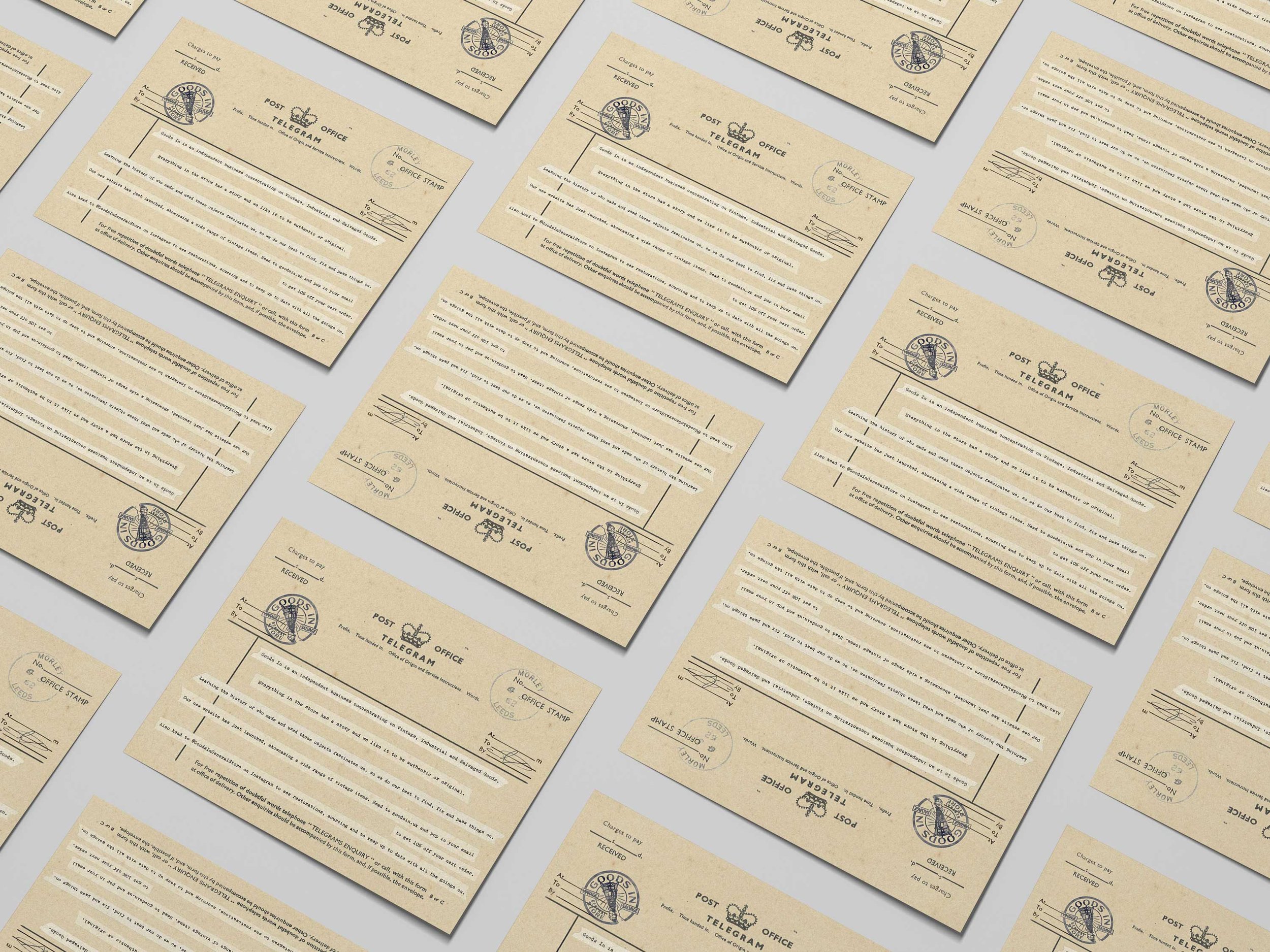
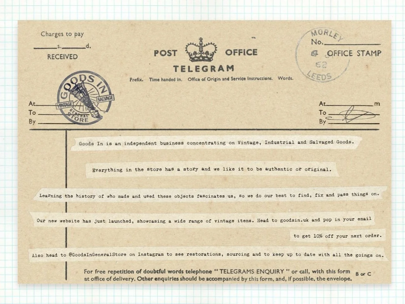
For visitors to the stand, we wanted to design a flyer that wouldn’t just be chucked in a bag and forgotten about. We wanted to create a flyer that would be held onto, and easily-remembered. Before the time of email, WhatsApp and other forms on instant communication, one of the quickest ways to send a loved one or friend a message would be via telegram. We wanted to revive the joy of receiving a telegram, albeit for a fleeting moment, for those visiting the stall.
Using custom-illustrated inked stamp versions of the business logo and location, along with scanned tape and pressed typeface gave the telegram an authentic feel, especially with weathered and aged texture effects.
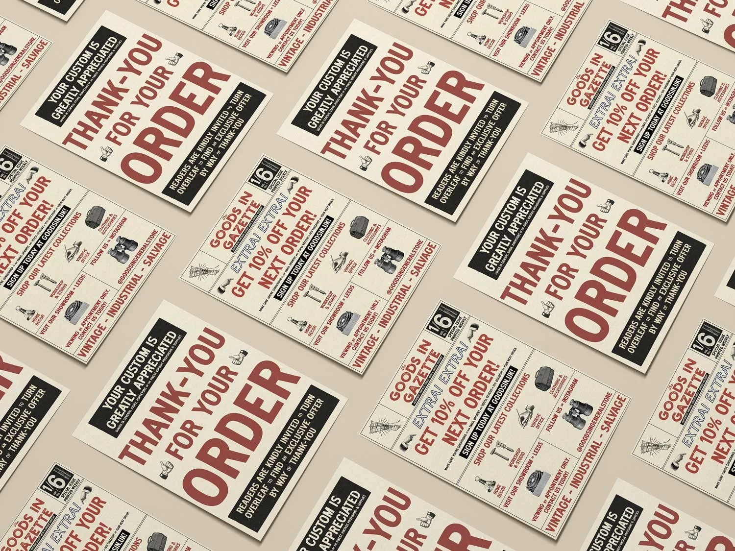
For the front of the flyers, I drew heavily on American news sandwich boards from the late 1920’s to the early 1960’s, a date range which fits the business’ products. Custom-illustrated manicules (a typographic mark with the appearance of a hand) paired nicely with a vintage news-inspired typeface, with key messages positioned in call-out boxes. For the reverse of the flyers, I was heavily inspired by the advertising pages of the same newspapers. Period-appropriate illustrations were paired with the same vintage typeface to showcase the business’ wider range of products, special offers, and promote the Instagram page of the business.
Along with the flyer designs, we worked on some branding elements, in particular the primary typeface used by the business, notably on its business cards. I selected a range of typefaces that were authentic to the relevant era for the business and presented a number of options.
WANT TO TRANSFORM YOUR BRAND TOO?
Please fill out the form below with some brief details about your brand, project, timeline, and budget.
I aim to respond to all enquiries within 24 hours.
Takes approx. 1 minute


