

Catch of the Day: Food & Drink Branding
Catch of the Day is a Fish and Chip Shop with a difference. A contemporary and creative take on the classic British takeaway cuisine, Catch of the Day blends staple, traditional Fish and Chip dishes with more modern additions - sustainably-caught fish and meat, locally-sourced potatoes, and hand-picked suppliers.
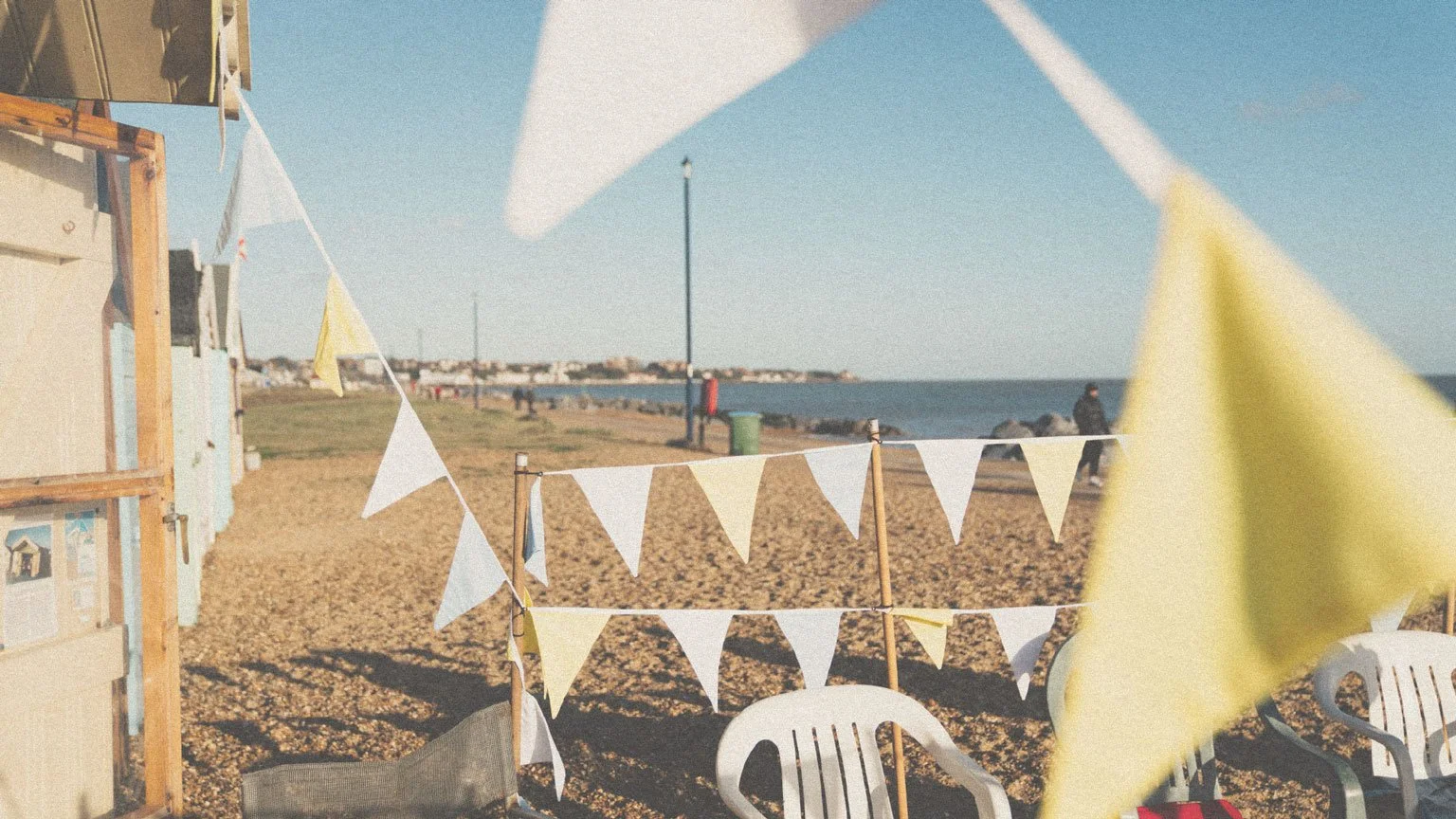
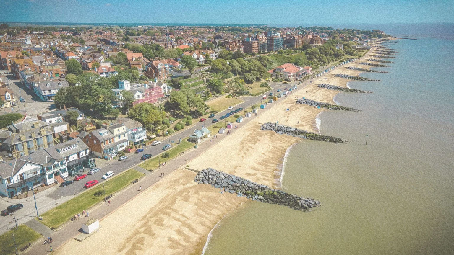
Starting up in Felixstowe, a classic seaside town on the Suffolk coast, the brand’s aim is to revitalise and breath life into a cuisine known for it’s greasy paper, wooden chip forks and copious amounts of salt and vinegar.
The aim for this project was to create a brand identity that aligned with the owner’s value of good quality, sustainable food, that’s “good enough for Nan”, harking to their commitment to exceptional dishes and friendly service.
We also wanted to inject an element of fun, creativity and playfulness into the branding, with the aim of helping the brand attract a younger audience. Opening in an area surrounded by other street food businesses, the brand needed to stand out with a bold, but cohesive, authentic and nostalgic visual identity.
-
Food & Drink
-
Logo Design
Brand Identity & Guidelines
Typographic Direction
Colour Direction
Print & Digital Design
-
2023

Brand story & Strategy
Catch of the Day aims to disrupt the classic fish and chip brand by infusing it with a modern, conscientious twist - think sustainably caught fish, locally sourced spuds, and a tagline or ethos of “good enough for Nan.” The identity needed to feel familiar yet fresh, standing out amid Felixstowe’s vibrant street-food landscape with bold, cohesive visuals rooted in authenticity and food-and-drink brand storytelling.


Behind the Brand
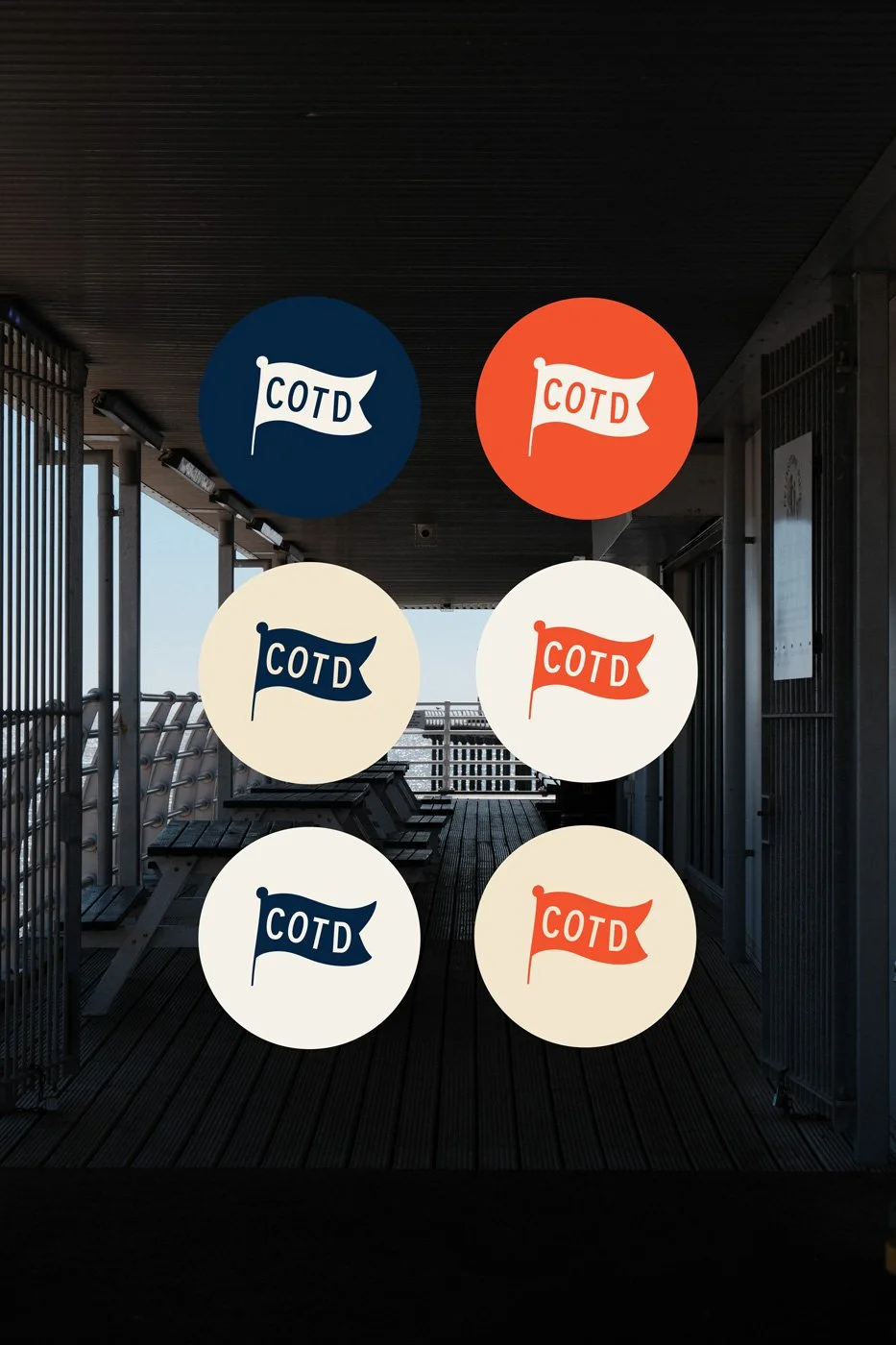
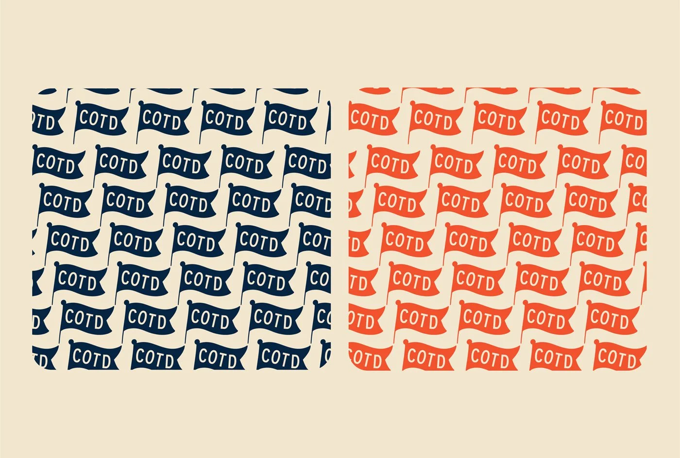
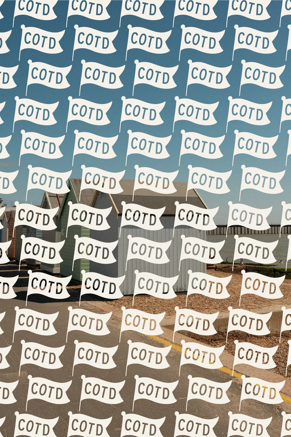
For a food and drink branding project like this, where the brand has a storied past and a strong narrative, there needs to be balance of storytelling with authenticity. We began by looking at the history of the family and the heritage of fish and chips as a cuisine, drawing on the typography, signage, and seaside charm that makes this food so iconic. The resulting brand marks combines bold lettering with a playful flag motif, drawing on nostalgic memories of sandcastles, 99p ice creams and sand between the toes, creating an instantly recognisable icon while still feeling approachable and warm. It speaks to the history of the British seaside without slipping into the cliché of a fish logo.


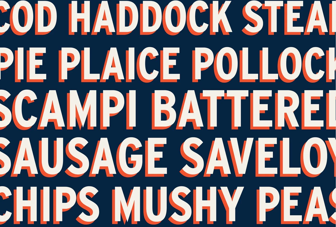
Typography
Typography plays a huge role in food and drink branding, especially for a business rooted in tradition. For Catch of the Day, we chose typefaces that echo classic seaside signage - bold, confident lettering that instantly communicates trust and familiarity. The primary typeface has a slightly condensed, hand-painted feel, reminiscent of traditional shopfronts and menu boards you’d find along the coast. Paired with a playful, curvy slab serif accent font, and a clean, modern serif for large amounts of text, the typography system balances heritage charm with readability and versatility.
This mix allows the brand to flex across everything from shop signage and menus to social media graphics. Headlines feel characterful and full of personality, while body text remains clear and practical for menus and digital use. The typography ensures Catch of the Day has a strong voice, reinforcing its promise of honest, high-quality food served with warmth.


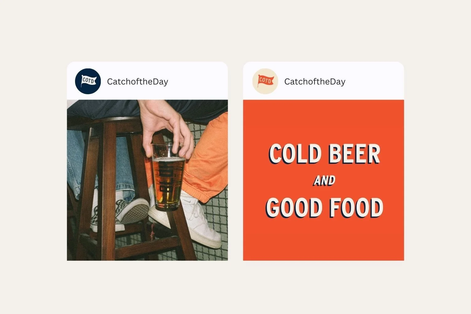
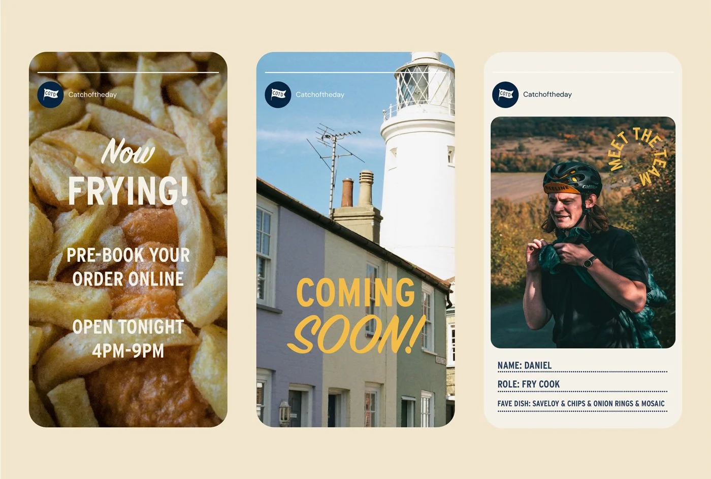
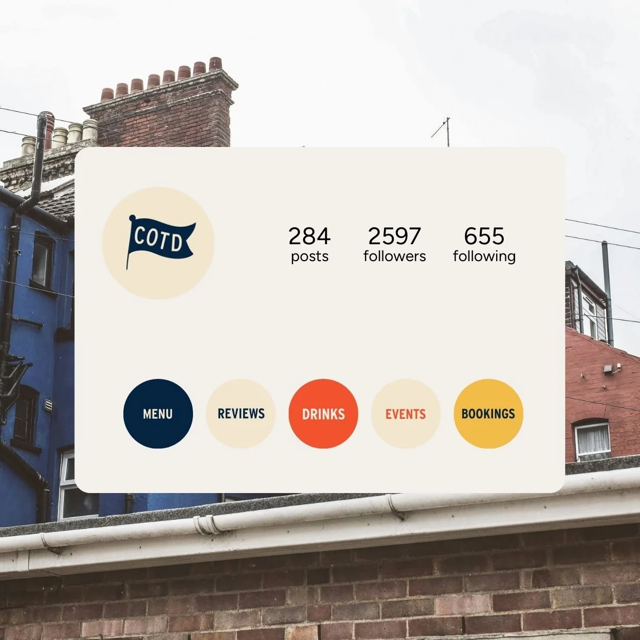
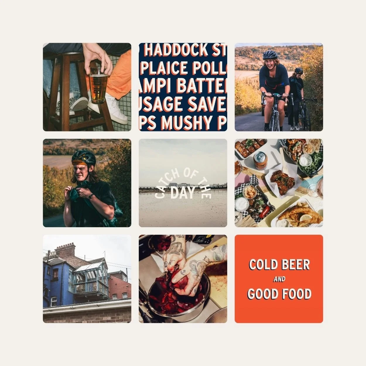
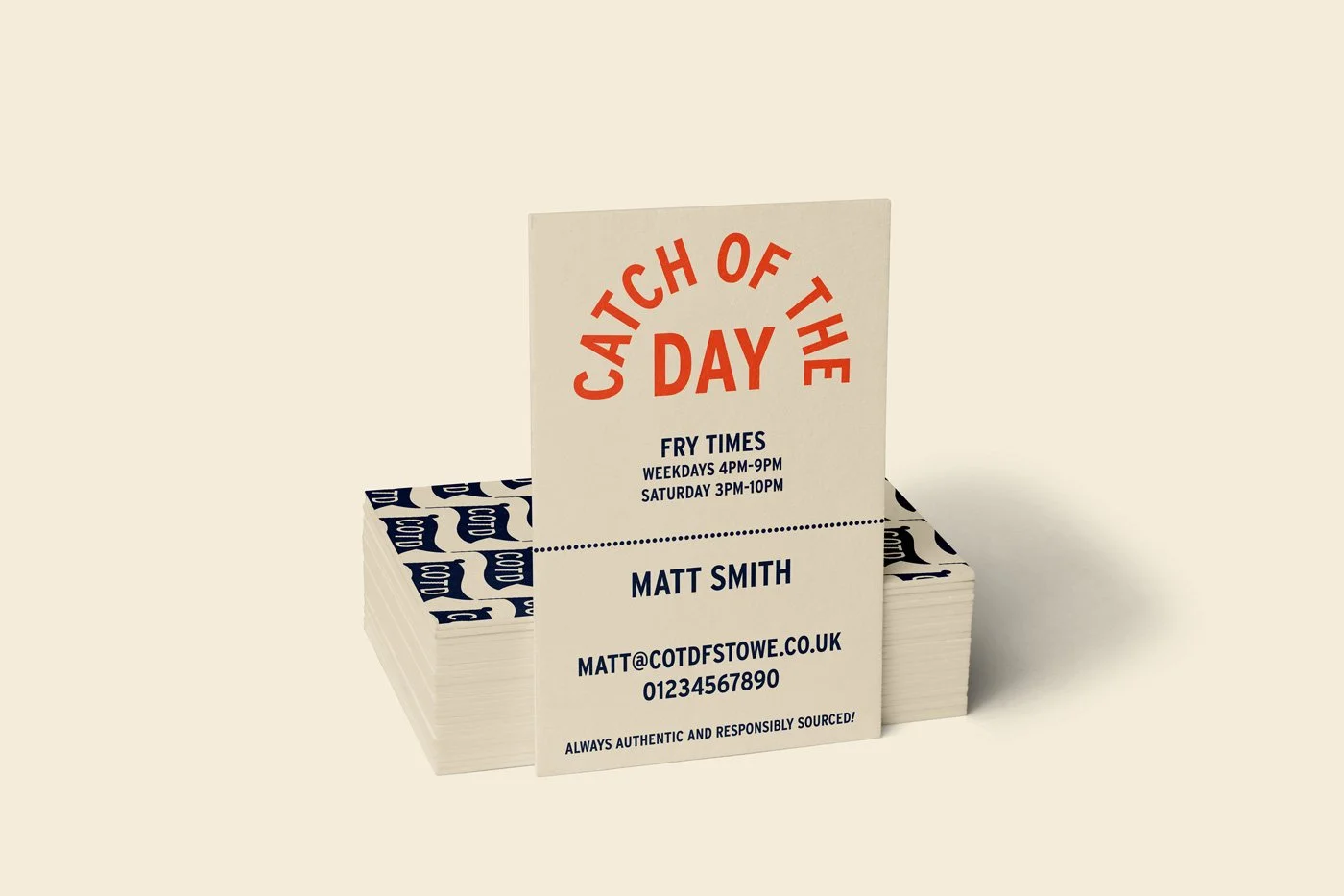
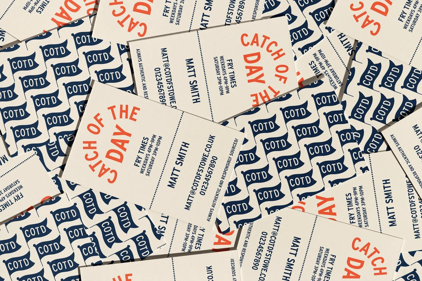
Visual identity & digital design
A big part of any in-person food and drink brand is its packaging, signage and digitial touchpoints, where customers interact directly with the brand. Especially for takeout or fast food brands, so often, your social media and digital presence or signage is the first impression you’ll make on a customer, and the packaging is the last impression.
For Catch of the Day, we developed a flexible visual identity that works across menus, signage, packaging, and digital platforms. The colour palette pulls inspiration from the sea - deep navy blues, fresh linen whites, and a pop of red - to give everything a crisp, coastal energy, whilst remaining unmistakably British. The illustrations and supporting typography bring an extra layer of personality, ensuring the brand feels fun, memorable, and unashamedly local.


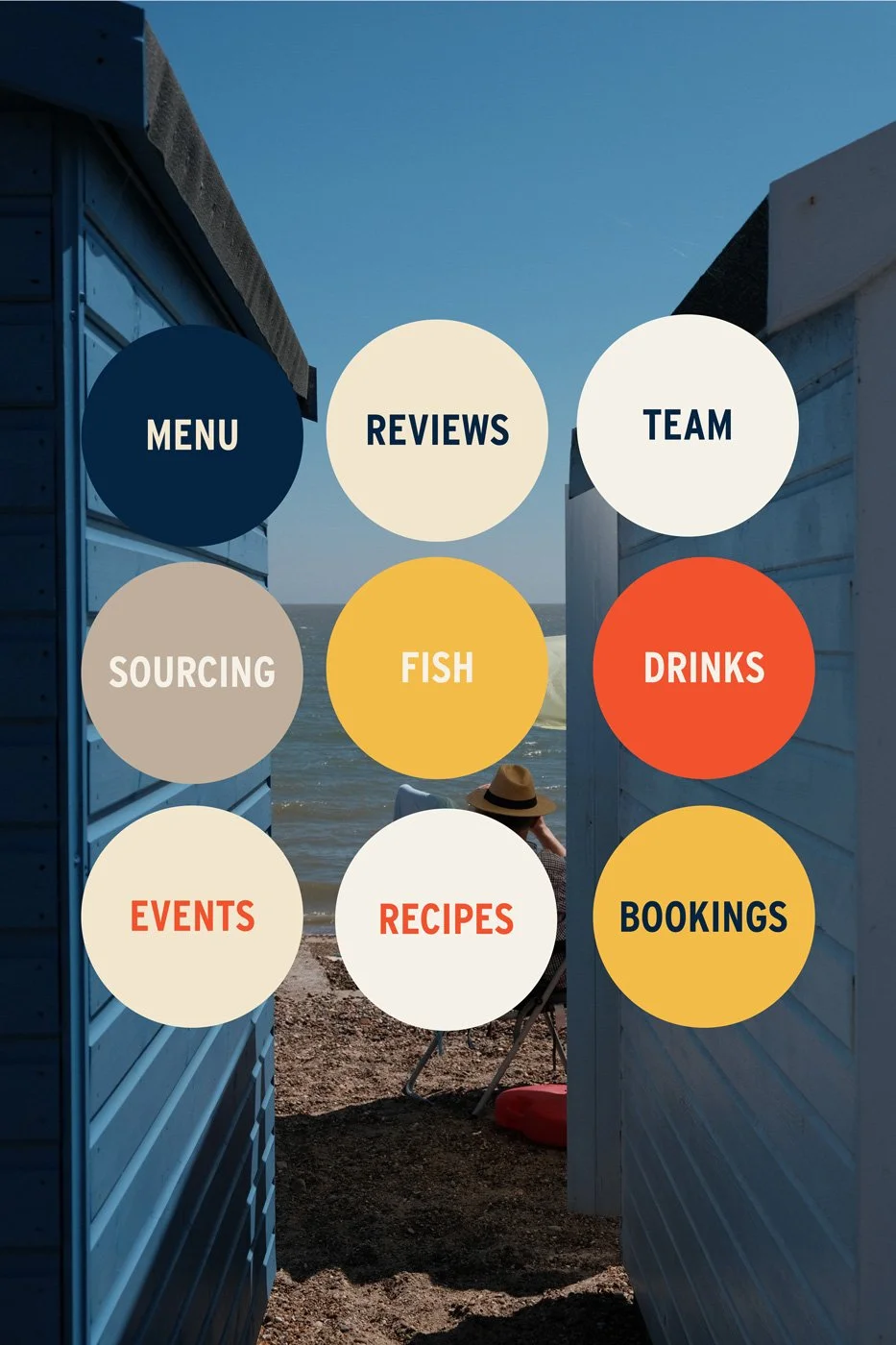
Menu Design
In food and drink branding, the menu is often the first real two-way interaction a customer has with a business - it’s not just functional, it’s part of the brand experience. For Catch of the Day, the goal was to design a menu that felt welcoming, easy to navigate, and true to their seaside heritage.
We introduced a clear typographic hierarchy to make browsing simple, with bold section headers and ample spacing so nothing feels crowded. The colour palette and graphic details echo the wider brand identity, tying the menu back to the shop’s signage and packaging. Playful nautical flourishes and subtle textures give the design character, while still keeping the focus on the food itself.
The end result is a menu that balances style with practicality: easy to read at a glance, quick to update when needed, and perfectly aligned with the warm, nostalgic identity of Catch of the Day. It transforms an everyday touchpoint into a brand moment that customers remember.


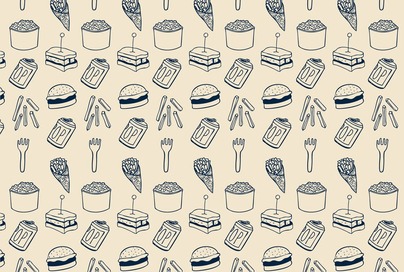
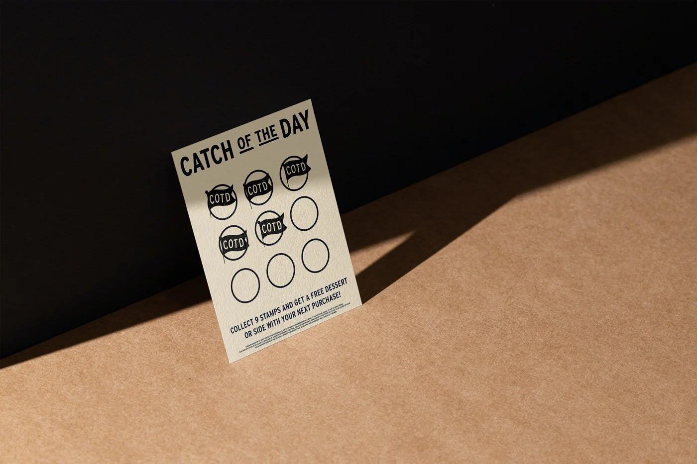
Custom Illustration & Brand Patterns
Illustration is a powerful tool in food and drink branding, adding personality and storytelling to a visual identity. For Catch of the Day, we created a suite of bespoke illustrations inspired by classic British fish and chip shop imagery - from hand-drawn mushy peas and fish finger sarnies to cans of pop, chips and chip forks.
By weaving these illustrations throughout the identity, we gave Catch of the Day a flexible brand toolkit. Each piece can be used on its own or layered together, helping the business adapt its look across touchpoints without losing consistency. The result is a distinctive visual language that customers immediately recognise and connect with.
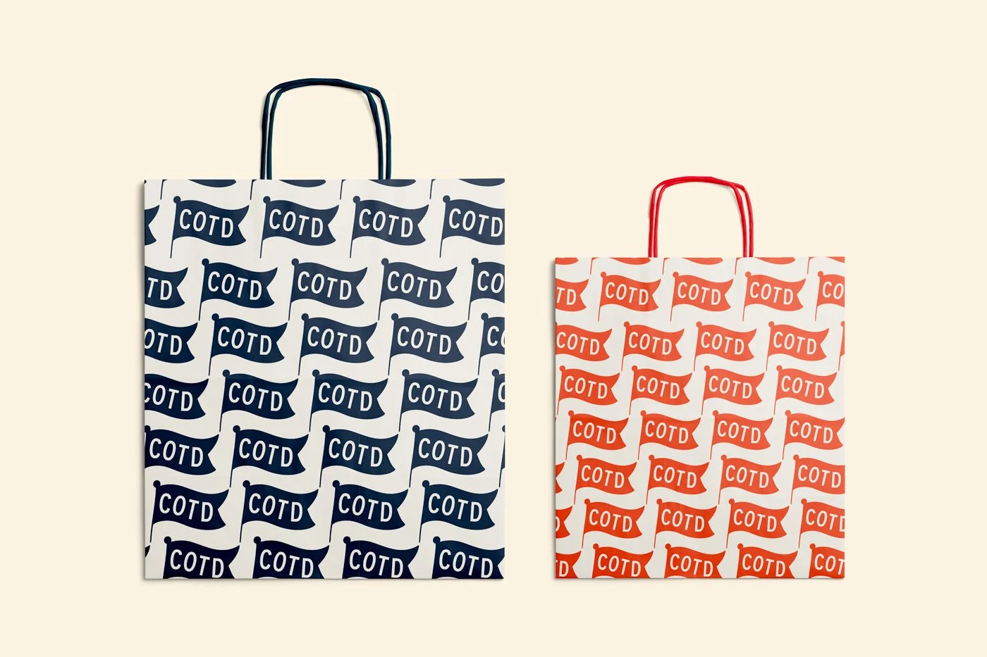
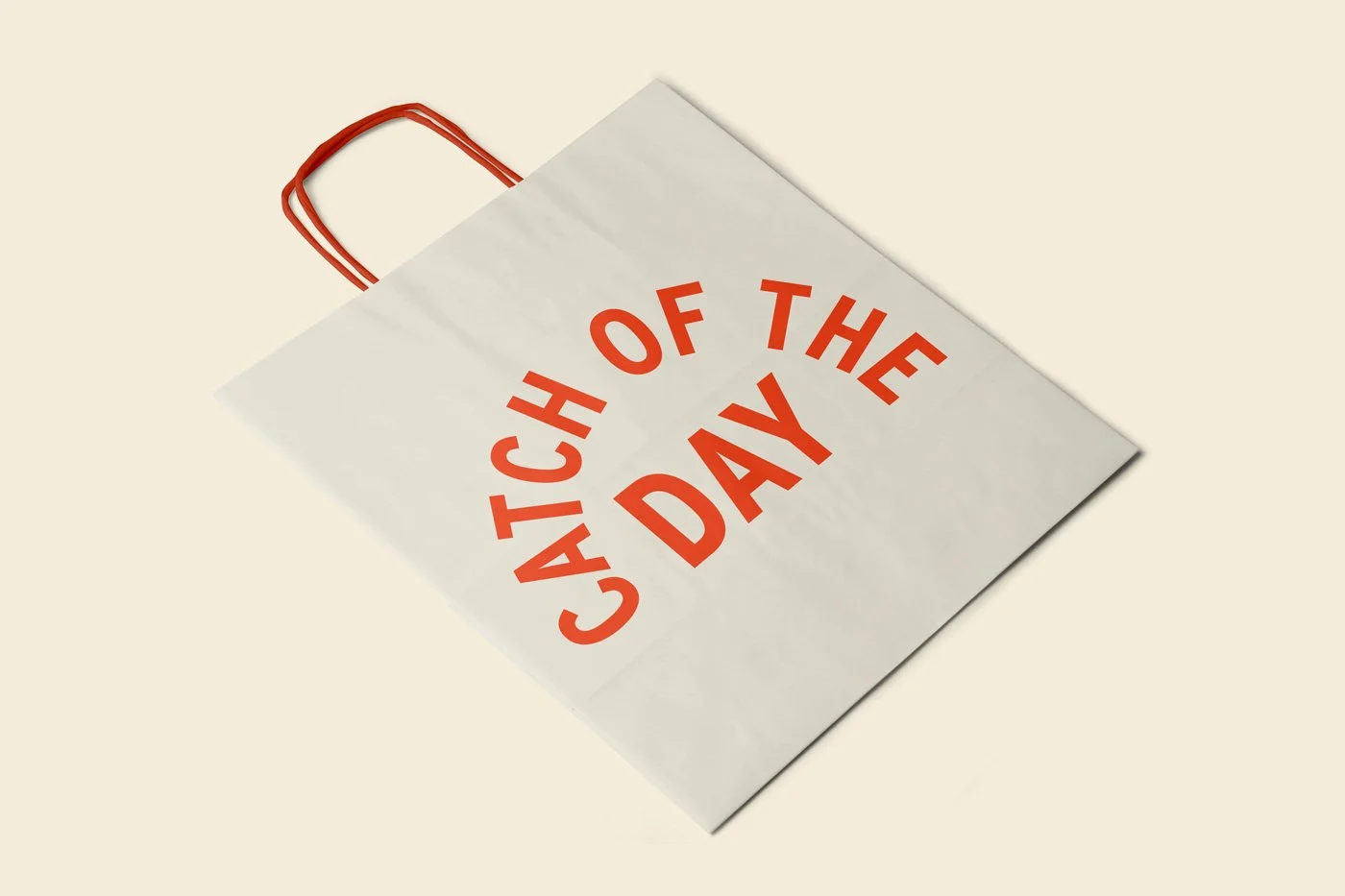
Packaging
The packaging system incorporates the brand’s bold typography, hand-drawn illustrations, and a simple seaside-inspired colour palette. From takeaway boxes and paper wraps to labels and stickers, every element was considered to ensure a consistent customer experience.
Beyond aesthetics, functionality was key. Materials were chosen with sustainability in mind, while layouts were designed for easy reproduction across a variety of food formats. The result is packaging that not only looks beautiful, but also works hard in a busy food service environment.
By blending creativity with practicality, the packaging design helps Catch of the Day leave a lasting impression - turning every meal into a branded experience that customers will remember.
Want to transform your brand too?
Please fill out the form below with some brief details about your brand, project, timeline, and budget.
I aim to respond to all enquiries within 24 hours.
Takes approx. 1 minute