

EASTLEIGH CLIMBING SCHOOL: BRAND IDENTITY DESIGN
Eastleigh Climbing School is a well-established indoor climbing centre that also offers outdoor climbing experiences across the country. With a mission to make climbing more accessible and an emphasis on community, adventure, and progression, they’ve built a reputation for expert instruction and high-quality facilities. However, their existing branding no longer reflected who they were or where they were headed.
They approached me for a full rebrand—one that would modernise their identity, bring consistency across all touchpoints, and better align with their values. They needed a brand that would not only resonate with their existing community but also help them stand out in an increasingly competitive industry.
THE CHALLENGES
The aim for this project was to create a modern, dynamic brand identity that reflects their passion for climbing and adventure.
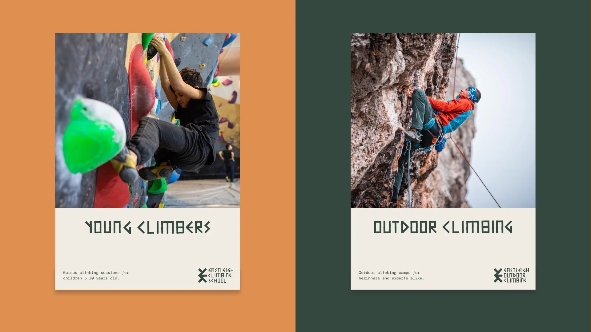
Develop a visual system that works across both their indoor centre and outdoor experiences.
Ensure the branding feels welcoming and accessible to both beginners and experienced climbers.
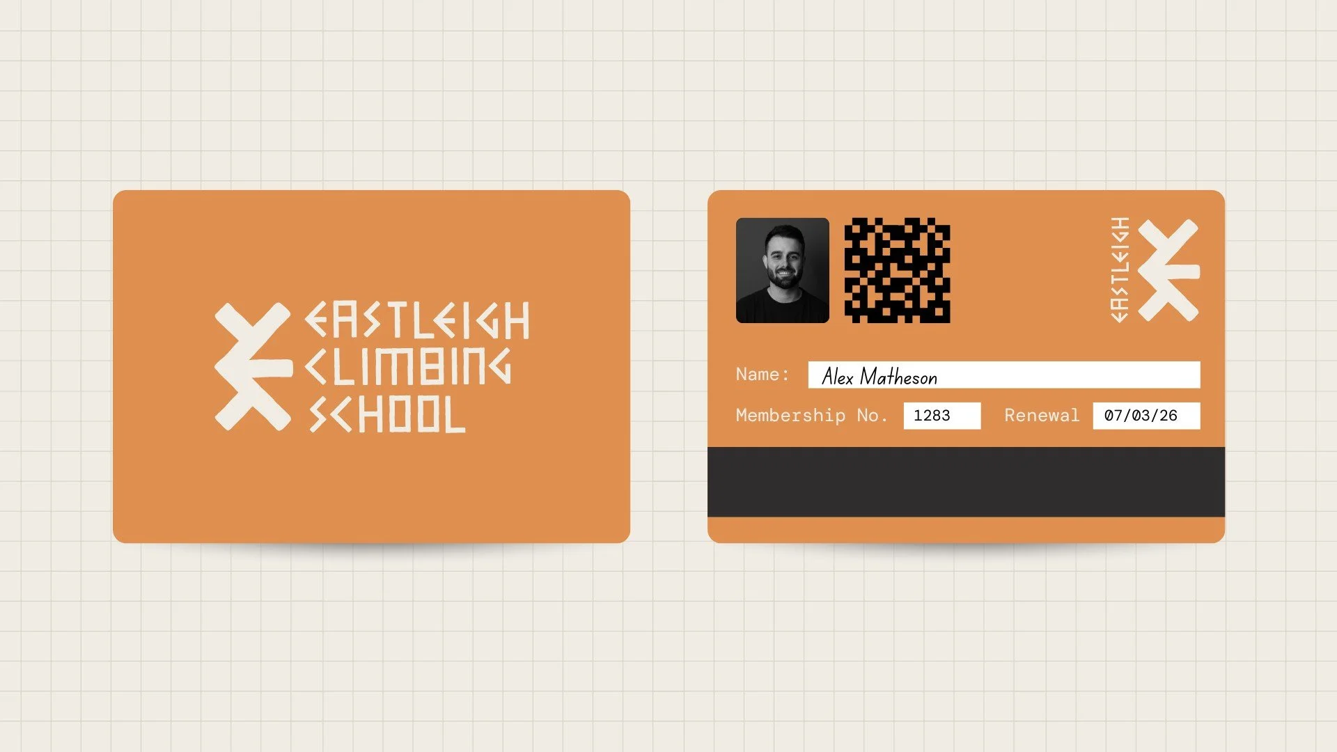
Introduce a fresh colour palette, typography, and logo that feel bold, confident, and timeless.
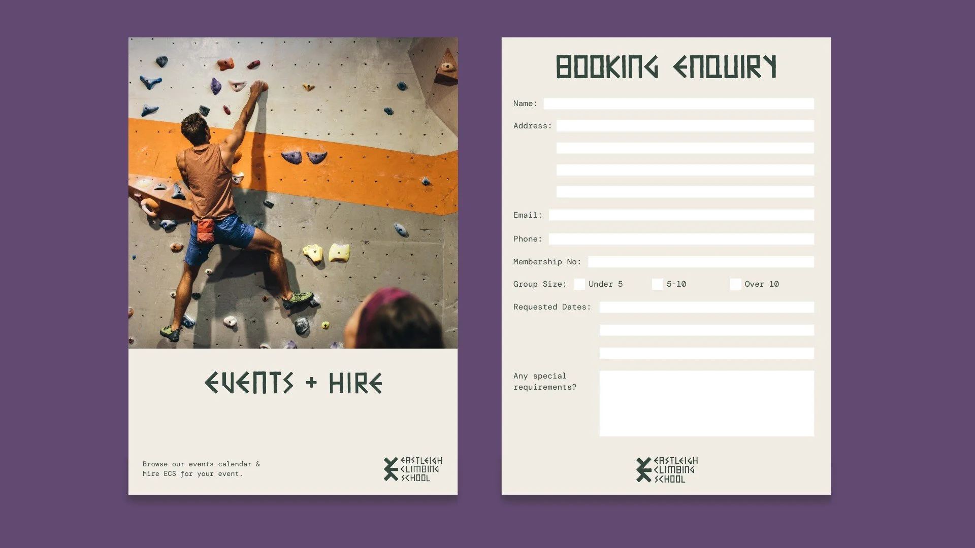
Provide brand guidelines to ensure consistency across signage, marketing materials, and digital platforms.
THE SOLUTION
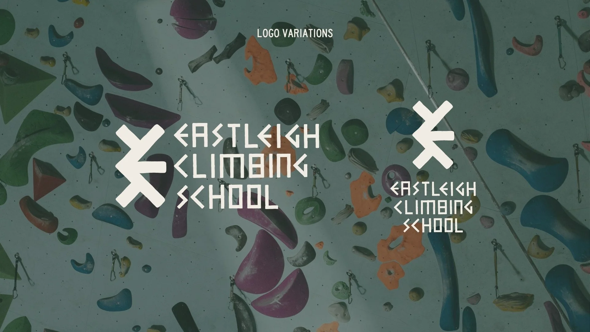
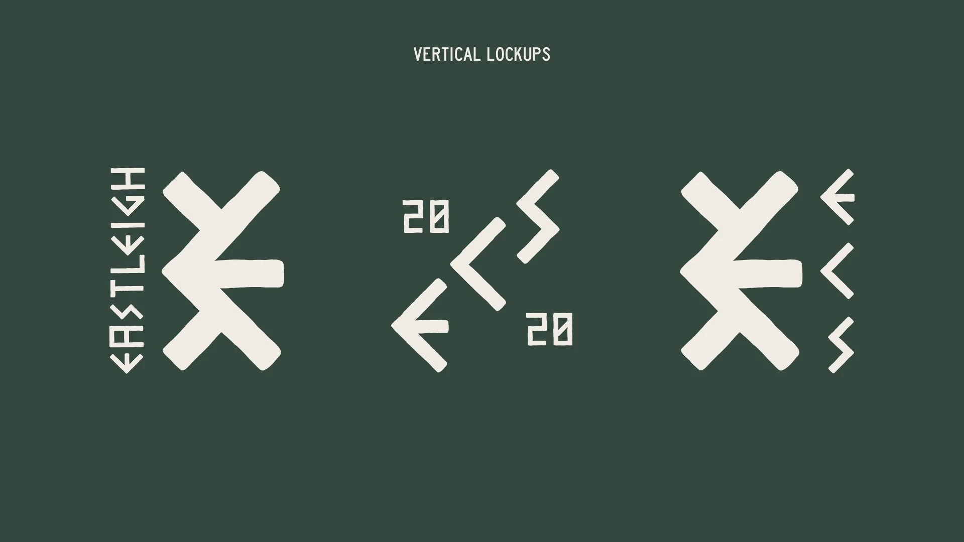
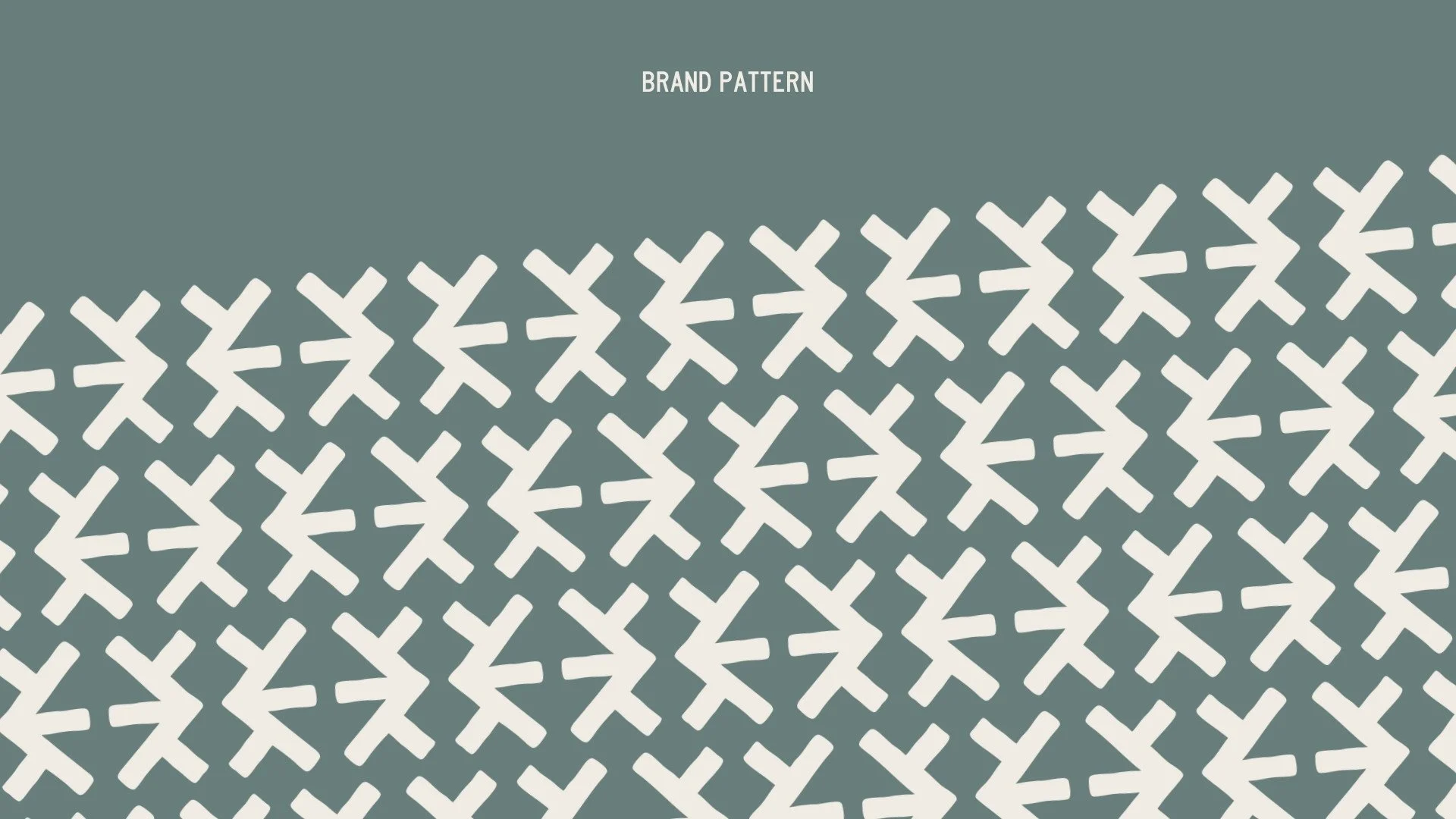
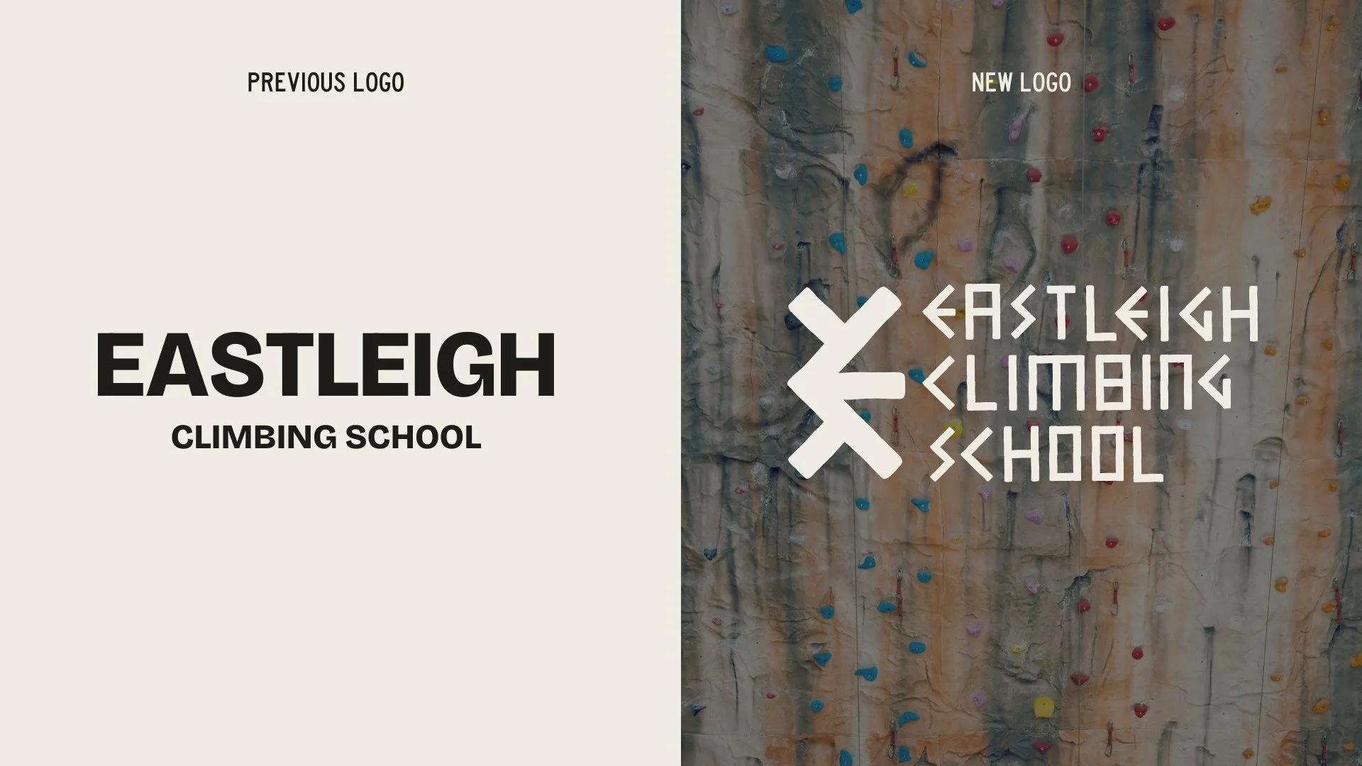
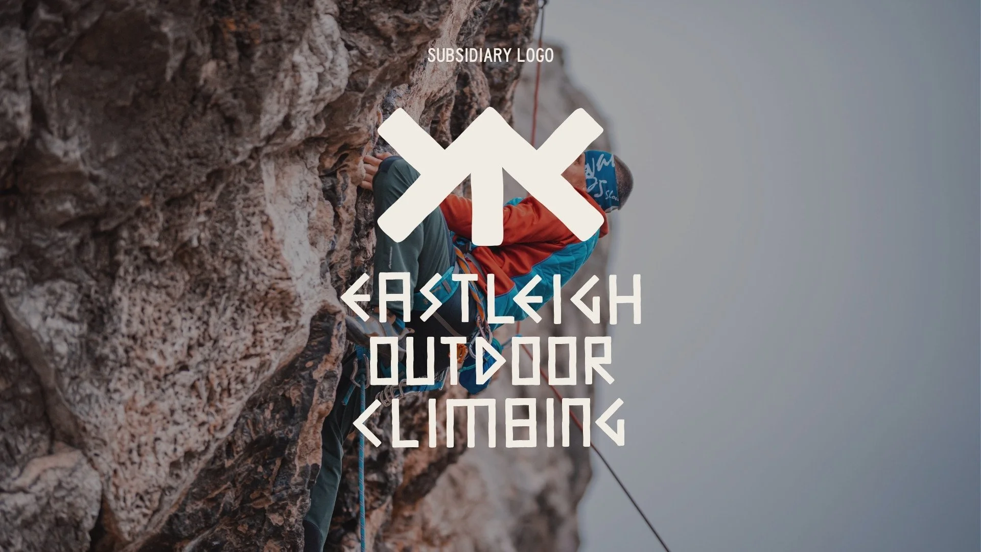
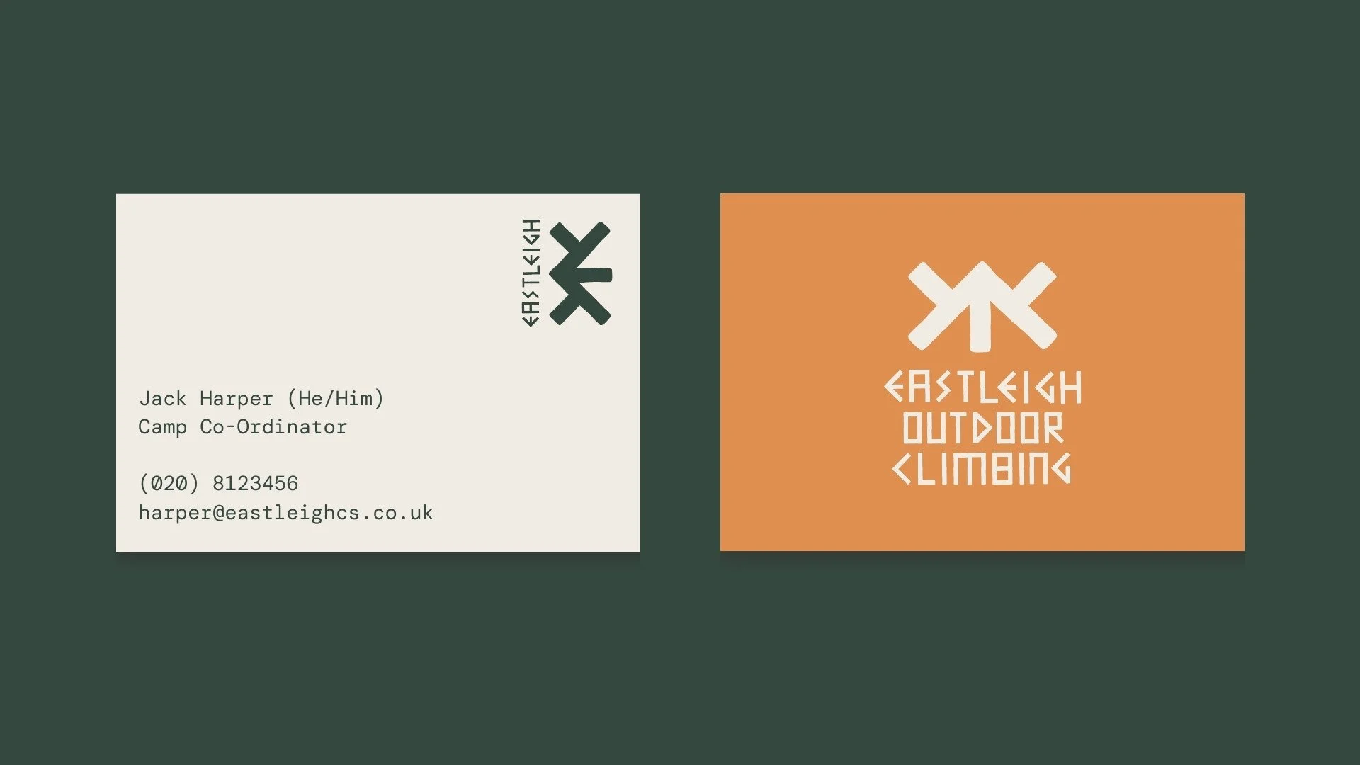
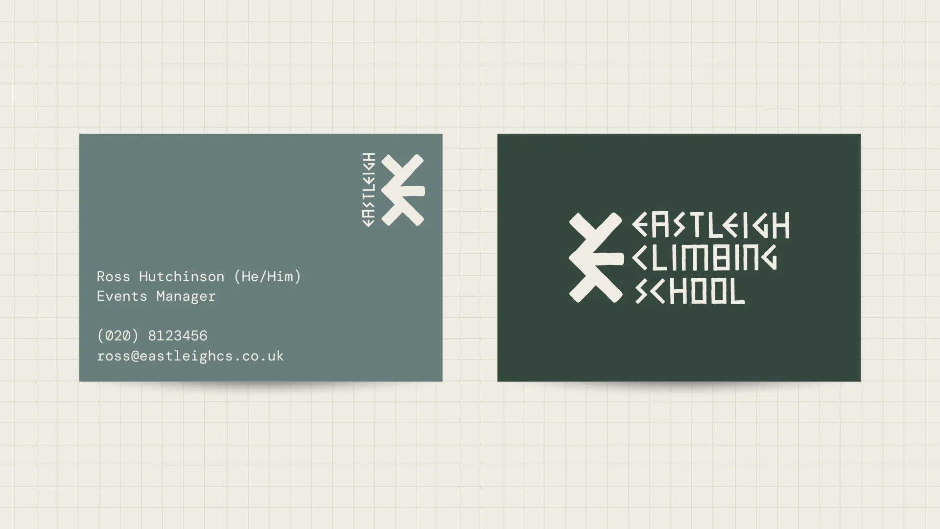
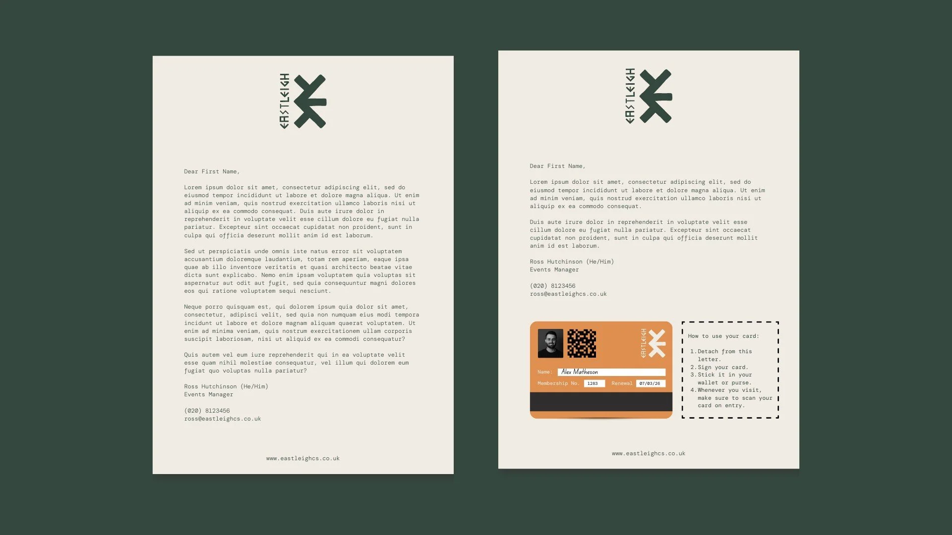
The new brand identity captures the energy, challenge, and community spirit at the heart of Eastleigh Climbing School. Inspired by the movement and geometry of climbing holds and rock formations, the new logo and graphic elements create a strong, adventurous visual language. The colour palette balances earthy, natural tones with vibrant highlights, reflecting both the indoor and outdoor aspects of their offering.
Typography and layout choices ensure clarity and accessibility, whether on digital platforms, printed materials, or wayfinding signage within the centre. A custom icon set was developed to represent different climbing disciplines, making navigation and communication more intuitive. The brand guidelines provide a flexible yet cohesive system, ensuring consistency across all marketing touchpoints, from social media to merchandise.
This rebrand not only modernises their identity but also strengthens their position as a leading climbing school—welcoming, professional, and built for adventure.


WANT TO TRANSFORM YOUR BRAND TOO?
Please fill out the form below with some brief details about your brand, project, timeline, and budget.
I aim to respond to all enquiries within 24 hours.
Takes approx. 1 minute